Exhibition spaces are competitive by nature. Visitors move quickly, absorb information at speed, and decide within seconds whether a stand is worth their time. In this environment, call-to-action (CTA) graphics on booth walls are not decorative extras; they are strategic tools that guide behaviour, spark conversations, and turn footfall into meaningful engagement. When designed and positioned with intent, CTA graphics help brands communicate value clearly while encouraging visitors to take a confident next step.
This guide explores how to use CTA graphics effectively on booth walls, from planning and design to placement and measurement. It takes a practical, forward-looking approach suited to modern exhibitions, particularly those using modular and shell scheme environments.
A call-to-action graphic is any visual element that encourages a specific response. In an exhibition setting, this might be asking visitors to scan a QR code, book a demonstration, speak with a representative, or sign up for further information. Unlike general branding graphics, CTAs are purposeful and outcome-driven.
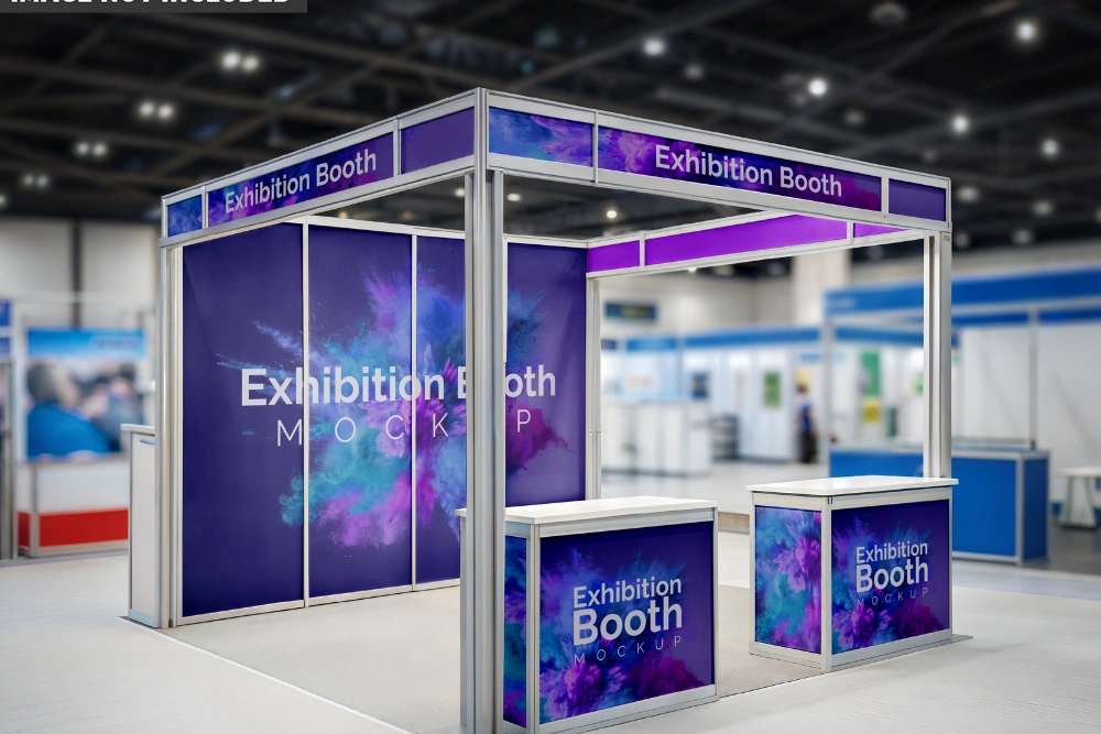
Booth walls provide an ideal surface for CTAs because they frame the visitor experience. Walls are often the first and last things people see when approaching or leaving a stand. Well-planned CTA graphics turn these surfaces into silent sales assistants that work continuously throughout the event.
In shell scheme environments, where structure and dimensions are fixed, CTA graphics become even more important. They allow exhibitors to maximise impact without altering the physical framework, making shell scheme graphics a powerful tool for clear messaging.
Before any design work begins, it is essential to define what success looks like. CTA graphics should always support a primary objective rather than trying to do everything at once.
Once the objective is clear, the CTA can be shaped around it. A stand focused on lead generation might use graphics that invite visitors to “Register for insights” or “Access your tailored solution”. A brand awareness stand may prioritise softer CTAs such as “Discover how we work”.
Clarity at this stage ensures that shell scheme graphics remain focused and do not overwhelm visitors with mixed signals.
Effective CTA design balances creativity with restraint. Exhibition halls are visually busy, so graphics must be bold enough to stand out while remaining easy to understand at a distance.
Placement is just as important as design. Even the most compelling CTA can be overlooked if positioned poorly.
In shell scheme layouts, side walls often receive less attention than front-facing panels. However, these surfaces are ideal for secondary CTAs, such as encouraging visitors to connect online after an initial conversation. Using shell scheme graphics consistently across all walls helps maintain a coherent narrative throughout the stand.
Modern exhibitions blend physical presence with digital engagement. CTA graphics are a natural bridge between the two.
QR codes, short URLs, and near-field communication points can be incorporated directly into booth wall graphics. When used thoughtfully, they extend the visitor journey beyond the event itself.
For example, a CTA inviting visitors to “Scan for tailored IT support” can direct users to a landing page that captures contact details while delivering immediate, practical value. This approach is especially effective for service-led sectors such as it managed service providers London, where complex infrastructure, cybersecurity, and ongoing support services benefit from structured follow-up communication. In this context, CTA graphics act as a gateway, guiding prospects from a brief face-to-face interaction into a longer-term, consultative relationship that continues well beyond the exhibition environment.
Not all audiences respond to the same prompts. Understanding visitor intent is crucial when shaping CTA language and tone.
Business-focused audiences often respond well to CTAs that emphasise outcomes, efficiency, and expertise. Creative or consumer-facing events may allow for more expressive or playful language. The key is alignment. CTA graphics should feel like a natural extension of the brand voice rather than a generic sales push.
Shell scheme graphics offer flexibility here. Because panels can be updated between events, CTAs can be refined to suit different audiences while retaining a consistent visual framework.
| CTA Format | Best Use Case | Key Benefit |
| Short text prompt | High footfall areas | Quick understanding at a glance |
| QR code CTA | Lead capture and follow-up | Seamless digital transition |
| Directional CTA | Guiding movement | Improves stand flow |
| Question-based CTA | Engagement-led stands | Encourages conversation |
| Instructional CTA | Product demonstrations | Sets clear expectations |
Using a mix of formats across booth walls creates layers of engagement without clutter. The goal is to support different visitor behaviours while maintaining visual harmony.
Several pitfalls can reduce the effectiveness of CTA graphics if not addressed early.
Overloading booth walls with multiple CTAs confuses visitors and weakens response. Each wall should have a clear purpose, with one primary action supported by subtle secondary cues if necessary.
Another common issue is poor alignment between staff behaviour and CTA messaging. If a wall invites visitors to book a consultation, staff should be prepared to facilitate that action immediately. Consistency between visuals and human interaction reinforces trust and professionalism.
Finally, ignoring lighting conditions can undermine even well-designed graphics. Exhibition lighting varies widely, so testing colour and contrast choices in different conditions helps ensure consistent visibility.
CTA graphics should be evaluated just like any other marketing asset. Measuring effectiveness provides insights that can inform future exhibitions.
By reviewing these indicators, exhibitors can refine shell scheme graphics over time, ensuring that each iteration performs better than the last.
Call-to-action graphics transform booth walls from static backdrops into active communication tools. When planned with clear objectives, designed for visibility, and positioned strategically, they guide visitor behaviour and extend engagement beyond the exhibition floor. In shell scheme environments, where structure is fixed, CTA graphics offer flexibility, clarity, and measurable value. By aligning visual prompts with audience needs and integrating digital pathways, exhibitors can create stands that not only attract attention but also inspire confident action. With thoughtful execution and continuous refinement, CTA graphics become a long-term asset in building meaningful exhibition success.
© 2026 Foamex Board. All Rights Reserved.